Sunnybrook ALC Reporting App

Overview

In order to monitor and facilitate timely transfer or discharge of patients who require alternate levels of care (ALC), but do not require the intensity of care provided in their current setting, Sunnybrook Hospital (SHSC) has developed their own corporate software ‘eALC’ for online collection and reporting of ALC metrics. eALC also sends real-time ALC data to the Wait Time Information (WTIS) system under the Ministry of Health and Long Term Care (MOHLTC).

However, due to Adobe Flash End of Life, Sunnybrook decided to sunset eALC and integrate its features into SunnyCare, the hospital’s main EHR system. Working closely with Social Workers, Health Data Records and Quality Management, we redesigned what is now the ALC module in SunnyCare, while adding new improvements to better improve user workflow and data capture.

Timeline

7 months from late 2019 to Sept 2021
(on hold for a year due to COVID)

Client

Sunnybrook Health Sciences Centre (SHSC)

Role / Team

Solo Designer, accompanied with 1 Project Lead and 2 Developers

Platform

Website App

Tools

Axure, Figma, Zoom, Jira

Methods

Usability Testing (Moderated, In-person and Remote), Interviews, Heuristic Evaluation, Wireframing, Prototyping

Due to the proprietary and confidential nature of this project, I have omitted and obfuscated exact designs.

What is ALC, and why is it important?


Alternative Level of Care (ALC) is used to describe non-acute patients occupying an acute care bed that are awaiting placement to a chronic care unit, rehab, nursing homes, palliative care, etc.

As part of the Ministry of Health and Long Term Care Wait Time Strategy, Ontario hospitals are required to report ALC data in near real-time to Ontario's Wait Time Information System (WTIS). The strategy was developed to tackle a contributor to long ER wait times – high numbers of ALC patients occupying acute care beds and thus, preventing patients in the ER from being admitted to the hospital. ALC patients are often not discharged because the appropriate level of care they require is not available when and where they need it.

Thus, real-time reporting of ALC data would improve bed utilization by enhancing timely discharge for ALC patients, and allow hospitals, as well as MOHLTC, to better inform resource allocation and decision-making.

Getting Technical

eALC’s main front-facing functionality is an electronic ‘form’ for social workers to provide information about the patient once they are designated as requiring ALC. Once the social worker submits the form, eALC sends its information as a waitlist entry for the patient to WTIS. Depending on the patient’s outcome, the form can be updated, e.g. transferred, returned to acute, discharged, discontinued – any updates are sent to WTIS as well.

ALC Main Data Elements

From ALC Reference Manual V2, Ontario Health


Since eALC is a complex system that collects data specific to requirements defined by WTIS, I had to first understand what they requirements were, how the data was being structured, and all possible workflows/scenarios with the system. I worked closely with my project lead to understand the workflows, and read previous functional requirements documentation for details on form fields. I also reviewed the ALC reference manual published by WTIS, which was helpful in understanding ALC definitions and recommended clinical guidance in designating a patient ALC.

Guiding Principles for Designating a Patient ALC

From ALC Reference Manual V2, Ontario Health

Heuristic Evaluation

In order to meet the requirements set by WTIS, the current form itself had many fields for users to fill in. There were fields asking for different dates relating to the patient's ALC designation, e.g. most appropriate designation discharge date, which was difficult to input without knowing which date it's exactly asking for in relation to the ALC process. Thus, I decided to do a heuristic evaluation of the current system, in order to identify and prioritize usability issues according to tried-and-true usability principles. It revealed quite a few issues as presented in two high level themes below.

Form Content and Design

  • Extraneous information not related to the users’ selection: The ALC designation section shows all selection details before the user has made their selection. Too much information unrelated to the user’s selection can be overwhelming to process at a glance
  • Related form fields not grouped together: The form is pretty long to begin with, and especially since similar fields are not grouped together, it makes it difficult to make sense of the information that needs to be filled in
  • Irrelevant form content: There’s a section in the form relating to the percentage breakdown of ALC patients in Sunnybrook is irrelevant to the typical user, which is for the quality management and decision support team to keep track of ALC data at Sunnybrook. Thus, there's no need for it to be in the form itself
  • Cluttered form design: As highlighted by the points above, there are content in the form that are unnecessary to the users. Furthermore, the use of bright colours and the lack of local flow of the form competes with the user’s attention, making it

Action Task Buttons

  • Labeling with insufficient meaning: The ALC designation section shows all selection details before the user has made their selection. Too much information unrelated to the user’s selection can be overwhelming to process at a glance
  • Related form fields not grouped together: The form is pretty long to begin with, and especially since similar fields are not grouped together, it makes it difficult to make sense of the information that needs to be filled in

Identifying Redesign Goals

Keeping in mind that problems identified in the heuristic evaluation are not necessarily indicative of genuine problem elements within the design, we reached out to get user feedback. After consulting with frequent users of eALC, it confirmed our suspicions about issues identified earlier, and revealed that it also affected the accuracy of the reporting, with date related form fields being particularly problematic.

Furthermore, the form has to be completed within 48 hours of a patient designated ALC or any updates to their ALC status, so it is also critical that users has quick access to start the form, as well as a clear indication on when they last updated it so they can keep track of it. Given these considerations, we decided to focus on the following goals in the re-design:

  1. Re-vamp form design and layout - e.g. create clearer labels for form fields, remove extraneous content, and provide more guidance and clear definitions for form fields
  2. Clearly show the status of the form, e.g. when it was last updated, and who updated it
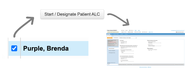
  3. Quick access to the ALC form in order to designate a patient as ALC

Redesign and Development

Using the insights we gathered, I created a few versions of the redesign and went through multiple rounds of feedback internally first before bringing it to the users for their feedback. This is to ensure what we're presenting is technically viable, and that we catch any glaring issues first as we need to be extremely conscious with our users' time (as we all know, our users are kindly sparing what little time they have in their very busy schedules!)

Here are some changes we made as a result of the redesign:

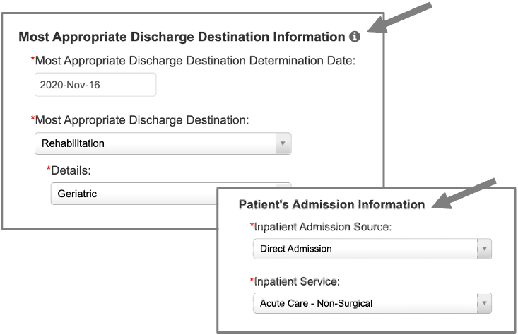
  1. Adding tooltips for the form fields that included a simplified definition of each field for easier comprehension
  2. Redesigned the layout of the form, e.g. grouped similar fields together and provided headers to provide better guidance and structure to the form
  3. Since users often worked from different patient lists, e.g. unit, location based, we added a button ‘Start / Designate ALC’ that was only visible to social workers so it wouldn’t clutter the view for other SunnyCare users


As the sole designer, I created, recruited and moderated the usability tests with 17 participants, with approximately 4 participants for each ‘iteration’. Through this process of testing the changes every 4 participants, we were able to validate whether the changes were successful, and worked to improve the design on every iteration.

Screenshot from one of my online user testing sessions!


As soon as we finished usability testing, I worked on finalizing the clickable prototype and demo-ed it, and also presented our usability findings to get green light on our project. This was successful in getting buy-in from our hospital's clinical leaders, as they could see how the product would work in real-life, reinforced with findings to back up our design decisions.

Go Live!

To help meet our deadline, I also supported QA testing efforts and tested all the front end functionality. Additionally, I led 14 user acceptance test sessions, getting sign-off from our users and fine tuning any last minute design details.

Working closely with the project lead and developers, we went live with ALC in SunnyCare in Sept 2021! The new feature now allows users to access and manage their patients’ ALC records from SunnyCare, and its easy access also allows the patient’s circle of care, e.g. physicians, nurses, to view their ALC record.

Project Learnings

Advocating for the user

Due to the lack of technical resources and a looming deadline, we were asked to integrate just the main functionalities, without any changes if possible. I learned to push for design improvements that would bring the most value to users, while being conscious of developers’ time and not pushing for ‘pixel-perfection’. Due to the time and resource limitations of the project, we had to focus on improvements that would have real impact to the users.

Navigating complex reporting requirements

The tricky part about designing for ALC was making it easy to use for our end-users, while satisfying the complex reporting requirements mandated by an external organization (WTIS). We had to find a balance between providing enough guidance on the form, but not over complicating or cluttering it since there were many specific scenarios depending on the patient. It was quite the challenge, but I’m proud that our team was able to overcome it!