Sunnybrook Discharge Summaries

Overview

For approximately 10 years, Sunnybrook's (SHSC) corporate software "eDischarge" has been used by clinicians to create, manage and distribute discharge summaries for patients. However, user feedback revealed multiple usability issues, including difficulty in keeping track of their status and updating it throughout the patient stay. Furthermore, with eDischarge being a flash application and Adobe Flash End of Life in 2020, Sunnybrook decided to sunset eDischarge and integrate its features into SunnyCare, the hospital’s main EHR system.

Working collaboratively with clinicians, we launched a new discharge summaries module in SunnyCare which addressed previous usability issues and improved clinician's workflow efficiency.

Timeline

Jan - Nov 2020

Client

Sunnybrook Health Sciences Centre (SHSC)

Role

Project Lead and
Solo Designer

Team

1 Clinical Analyst and 2 Developers

Platform

Website App

Tools

Axure, Figma, Draw.io, Excel, Zoom, Jira

Methods

Usability Testing (Moderated, In-person and Remote), Observations, Wireframing, Prototyping

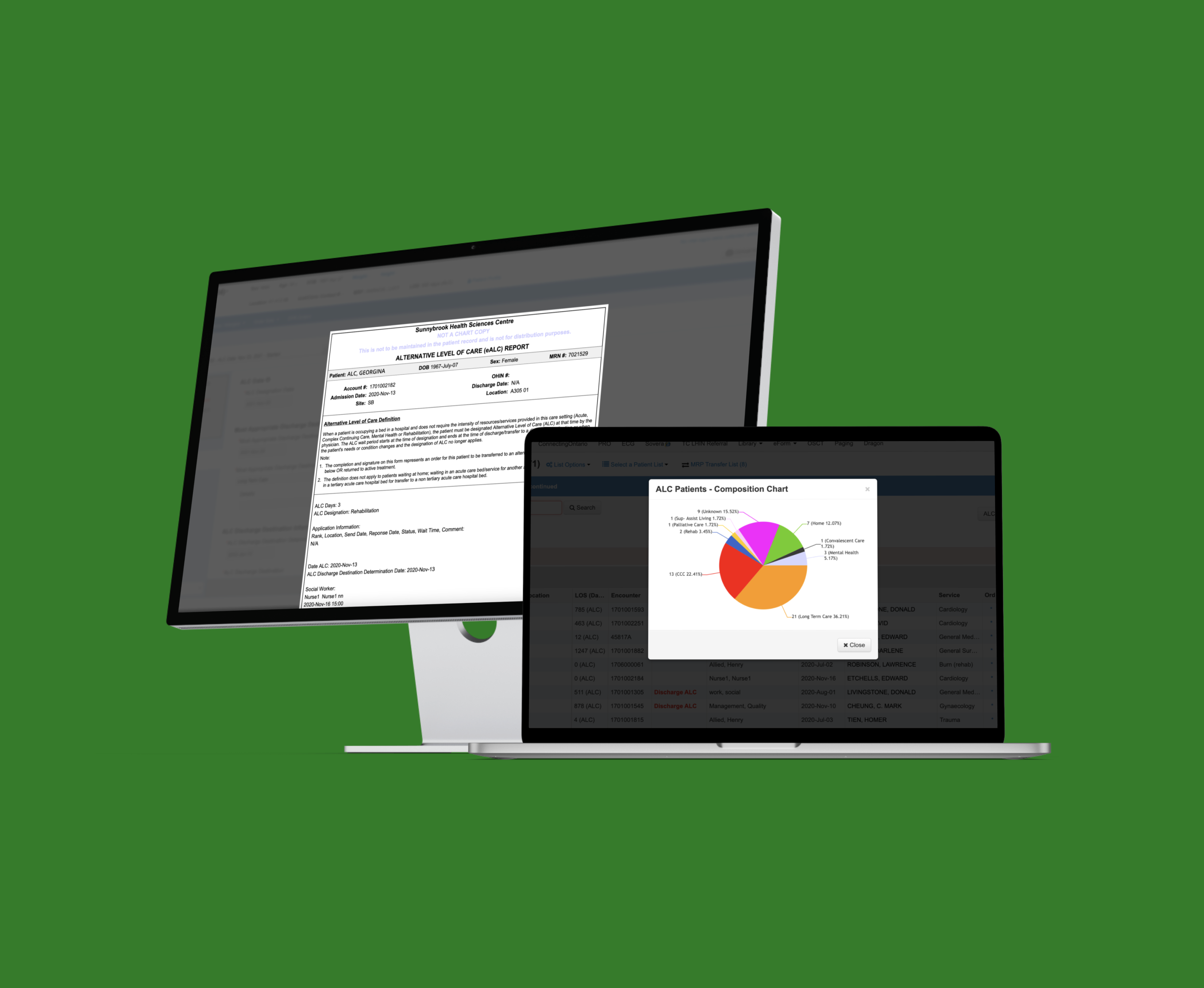
Due to the proprietary and confidential nature of this project, I have obfuscated designs from this case study.

What are discharge summaries and why are they important?


A discharge summary is a report that details the patient’s hospital stay, which typically includes reason for hospitalization, diagnosis, interventions, course in hospital, discharge plan including medications and follow-up instructions, and significant findings, e.g. abnormal lab results.

They are an invaluable resource that can improve patient outcomes by providing continuity of care, and safe transition to other care settings. Furthermore, timely discharge summary delivery to subsequent care providers reduces adverse events post-discharge by 20%.

Understanding eDischarge software

Before starting on any redesign work, I needed to familiarize myself with the current system “eDischarge”, since it’s a legacy system with over 10 years of upgrades and updates.

I took some time to dig deep into the workflows, reading documentation that outlined processes and workflows, e.g. how the discharge summaries are distributed to other ancillaries, and exploring eDischarge’s test environment to get first-hand experience.

The backend logic of eDischarge quite complex, as highlighted by some of its workflows below:

eDischarge distribution workflow for discharge summaries signed by MRP

Considering Hospital Policies in Redesign

When considering how eDischarge’s functionalities might look like in SunnyCare, there were some barriers to making the whole discharge summary process simpler and more efficient, since the discharge summary is a critical piece of patient documentation and rightly so, heavily regulated by the hospital.

Hospital Policies

  • Discharge summaries can be initially signed off by a resident, and then finally signed off by the most responsible provider (MRP), but they must do so within 48 hours of the patient’s discharge.
    Discharge summaries must be signed off by a MRP within 48 hours of the patient’s discharge. The summary can be initially signed off by a resident so that patients can leave at a timely basis, especially if the MRP is busy

  • Only certain clinical staff, e.g. physicians, residents, have access to the discharge summary. And depending on which ‘status’ the discharge summary is in, the security permissions changes, e.g. draft is the most accessible by most user groups, while final can only be edited by the MRP.
    This is to prevent users who might not have the proper security permissions from accessing the discharge summary


Exploring Current State

I also wanted to understand how clinicians are using eDischarge now, and explore how we can improve their current workflow - so I shadowed and interviewed clinicians from different areas of the hospital to observe how they manage discharge summaries, what information they reference to fill out a discharge summary, and any pain points they currently experience with the eDischarge, as shown below:

  1. Unable to access the discharge summary quickly and check the status of it, e.g. clinicians need to know the status quickly so they can prioritize which discharge summary needs to be reviewed and signed off at a timely manner
  2. Unclear whether discharge summary has been saved successfully on eDischarge
  3. No explicit clarification on reminder email from eDischarge to re-sign discharge summaries. Currently, clinicians receive reminder emails to sign-off discharge summary for their patients, but the email itself has no information about why certain patients require a 're-sign' - which leads to confusion especially when the clinician has signed off on it.

Redesigning eDischarge

Using these new insights, I looked into different ways to redesign eDischarge into SunnyCare, and created quick mockups of the redesigns. From the feedback we gathered during our initial research and usability testing, it was clear that accessing the discharge summaries took too long, and considering this was an important resource for physicians to fill out for their patients, I pushed for finding the best way to make this as efficient as possible.

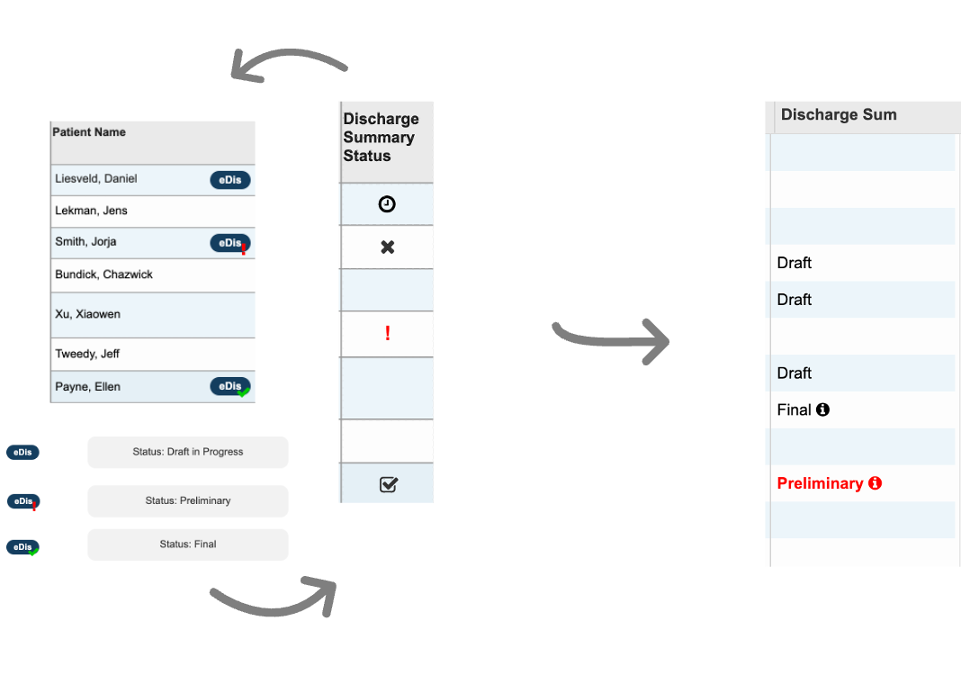
Our team brainstormed and figured the best way was to introduce a new patient list column to view status of discharge summary, as well as access it with just ‘one click’ - saving physicians tons of time by cutting it down to just one second. Since clinicians often need to update and access discharge summaries, the new patient list column will allow them to get to it without having to click deep into the patient’s chart. It was initially a divisive feature due to the short deadline and limited resources, but in the end it was flagged as an critical feature to develop and iterate on.

Interations of patient list column design

To ensure the designs would fit well within SunnyCare, I also collaborated with other project leads overseeing existing SunnyCare modules that the eDischarge redesign may affect. Their feedback was valuable in making sure the redesign was achievable with limited resources, and we were also able to identify opportunities for reusing existing components.

Usability Testing

Once the designs were agreed upon internally, I led and moderated usability tests with 19 participants to evaluate the usability of the redesign , e.g. can clinicians easily update and sign-off on discharge summaries, and is it an improvement from the current system?

One of our usability test scenarios

Areas of Improvement

The feedback we received proved that we were on the right track, though there were some improvements that we could work on.

  1. Easier way to start a new discharge summary
    We added the ability to start a patient’s DS from the patient list by hovering over an empty cell. We opted to keep the label hidden unless hovered over, in order to keep the column uncluttered since it was important that users could easily scan for other statuses, e.g. draft, final
  2. Reminder at sign-off if patient has not been discharged
    To support the workflow of ensuring discharge summaries are reviewed and signed off at the very end of the patient's stay (to ensure all info is up to date), we added a reminder note to the sign-off confirmation pop-up window if the patient has not been discharged yet.
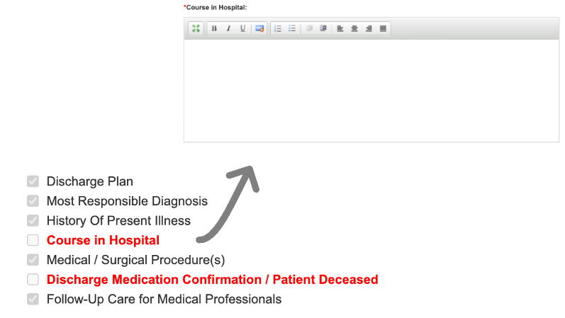
  3. Interactive sign-off checklist
    The discharge summary has multiple mandatory sections for the clinician to fill out before sign-off, so we implemented a dynamic checklist to indicate which sections are complete/incomplete, and clicking on each section will bring users directly to it


Once we addressed the feedback, I presented and demo-ed the designs to the department’s Design and Architecture Committee consisting of the Director of IT, Security, Medical Director, Implementation Directors. This was critical in getting senior leadership approval, as well as ensuring that the designs were aligned with the high level goals for the hospital.

QA and User Acceptance Testing

During development, I oversaw QA testing efforts, including testing integration with ancillaries to ensure that discharge summaries are being distributed successfully, and ran data migration test runs on our stage environment. There were also multiple modes of delivery, e.g. manual, auto-fax, electronic, and our team worked to ensure those channels were thoroughly tested.

Test scenarios for HRM and autofax distribution channels


As project lead, I also led 10 user acceptance test sessions with representative users to ensure that the developed software can handle necessary tasks in real-life scenarios. I took this opportunity to fine-tune the design, e.g. automatically defaulting to the patient’s encounter to save clinicians a click, if the patient only has one encounter.

The Big Launch

We launched in November 2020, and the module was well-received by the hospital with positive feedback. Since our team also covered post go-live support, we were able to quickly address and resolve any issues that arose, e.g. long hyperlinks inserted into the discharge summary caused an error in one of the distribution channels.

While we received positive comments, users were also looking for more features, e.g. the ability to unsign discharge summaries, which we plan on addressing in the next phase.

"It has personally improved my workflow because now I’m able to input key discharge plan related information into the discharge summary instead of relying on the physician or resident…therefore promoting a more collaborative approach to creating a holistic discharge summary for the patient"

— Occupational Therapist
Trauma Service

"Appreciate the ability to easily access other notes and results on the same screen, and the ability to copy and paste into the DS, [as well] as the ability to import signout info"

—Resident
Unit C4

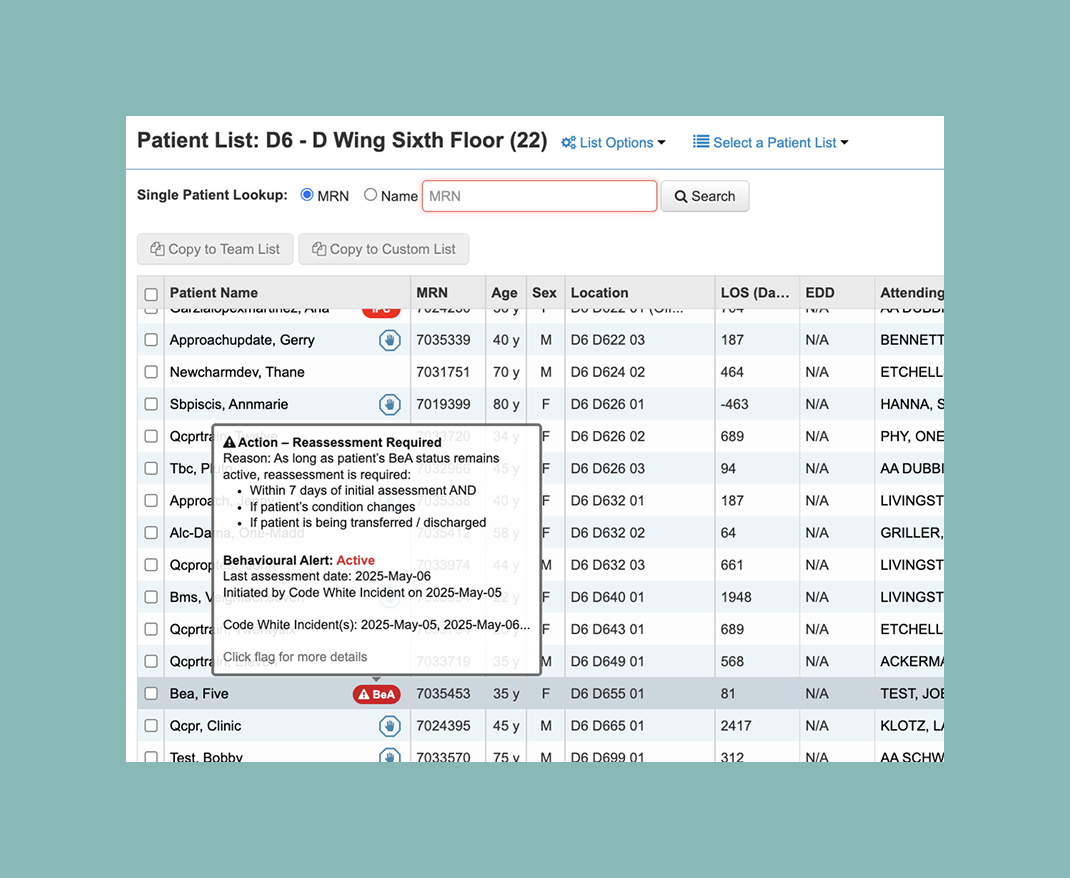
“Searching for patients' DS from the [old] eDischarge web application was time consuming. The new Disch Sum [patient list] column provides easier and quicker access to patients’ DS on the unit”

—Charge Nurse
Unit D6

Project Learnings

Leading a project from beginning to end

Leading a project to launch was a first for me! As a designer, I’ve been mostly focused on the design side of things, but I learned so much about QA testing, change / release management, implementation, and other stages of the development lifecycle that are critical to a successful launch. I reached out to my manager and other senior project leads who patiently answered my questions, and also worked closely with my colleague, Samer, who kindly walked me through the more technical side of things, e.g. HL7 interfacing and autofax distribution. Having now first-hand experience in all parts of the software life cycle, I have a whole new understanding for it, and has since helped me approach design in a holistic way.

Prioritizing requirements on a short deadline

With a short deadline soon approaching, we had to prioritize core features and keep things simple. As both the project lead and designer, I learned to focus on key functionalities and make tradeoffs to determine where the real impact and value to users would be. Working closely with developers and getting their feedback was also essential to ensure that the designs were achievable within the timeframe.

Embracing constraints

eDischarge was a separate application on its own, and so to integrate its functionalities into the main app (SunnyCare), I had to ensure my designs would fit seamlessly, and the experience for users would be consistent and cohesive. I spent time engaging with other project leads to ensure that the integration would fit well with the rest of the system, as well as the senior architect whose feedback was essential in identifying and reusing existing components.